Accelerate
Twelve products built on different systems, one design system to bring them together. A complete, ground-up redesign.
One design language across twelve products.
Years of acquisitions and in-house builds had left VelocityEHS with a dozen products on different, aging systems, each with its own navigation, patterns, and muscle memory. Accelerate unified them into one platform: one login, one way in, one set of components. I worked on the navigation, the screen redesigns, the documentation, and the testing that made it real.
The design system, documented as a clickable prototype and used by development every day.
Moving between products meant switching software.
Each product had arrived with its own stack, its own menus, and its own idea of what a button looked like. A safety manager moving from incidents to audits to training was learning three interfaces to do one job, with three logins, and the company was maintaining twelve of everything.
Reskin live enterprise software without breaking the workflows people depend on every day.
Map everything. Fix the way in. Then rebuild it, room by room.
Five on the UX team; my manager led the program and another designer owned much of the component library. Work moved ticket by ticket: discovery with product, design against the criteria, validation with front-end and architecture, review with the full team, then done. Capabilities moved in parallel and stalled on their own schedules, so the system had to hold steady while the products caught up.
- 01Site map
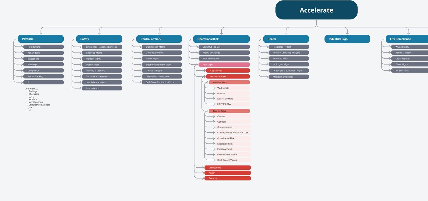
Every capability in the portfolio, charted before deciding where anything would live.
- 02Navigation
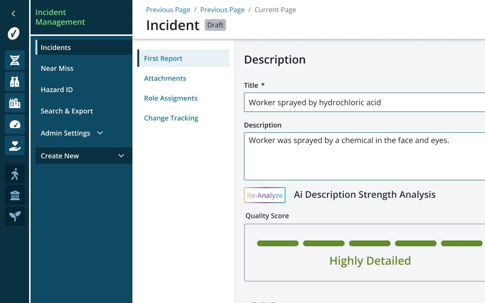
Two layers, decided by the design team. I worked out the details, including the capability nav.
- 03Components
PrimeReact adapted and documented, with rules for when and why.
- 04Screens
Every capability, dozens of screens each, reskinned in the new system.
- 05Teaching
A heuristics guide for the whole company, built from our own components.
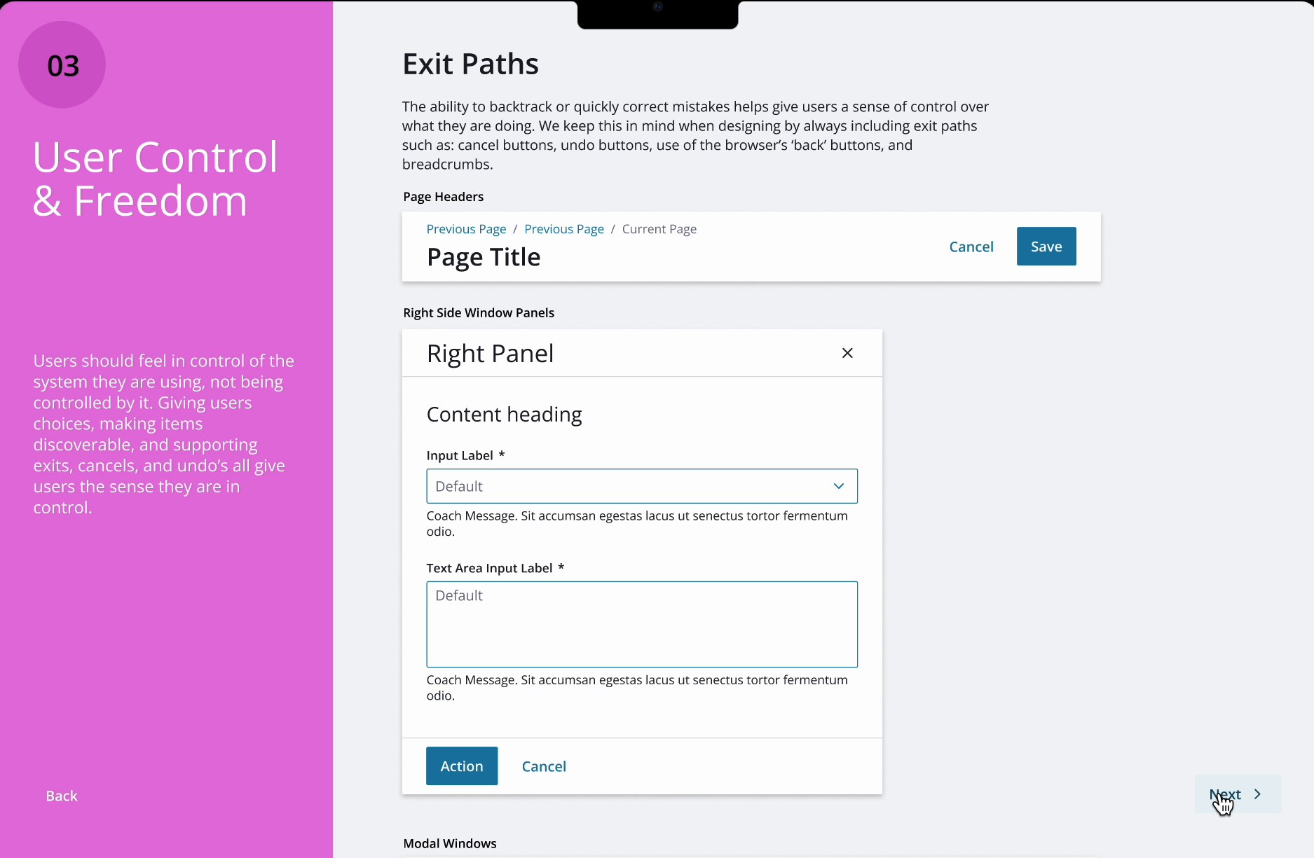
Nothing could be consistent until the way in was.
The design team decided on two layers: a global rail that lists every solution and the platform tools, and a capability nav that appears once you're inside one. I worked out the details from there: the states, the spacing, the treatment for solutions a customer hadn't bought, and the capability nav itself. Underneath, the legacy applications kept running while each was rebuilt, so nobody lost access to anything.
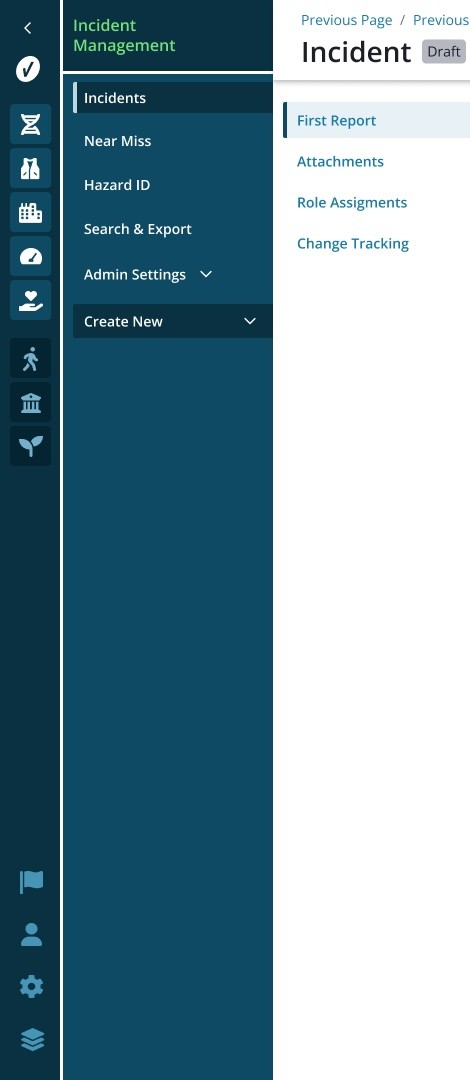
L1, the global nav. One entry per solution, always visible, always in the same order. Switching products is a click, not a new login. Solutions a customer hasn't licensed sit dimmed at the bottom, a business requirement, given a state of its own so it never reads as broken.
L2, the capability nav. Opens once you're inside a solution: that capability's destinations first, settings after. Every capability got the same shape, so learning one meant learning all of them.
L3, the page nav. Inside a record, the sections of that record. Three layers, each answering one question: which product, which part, which page.
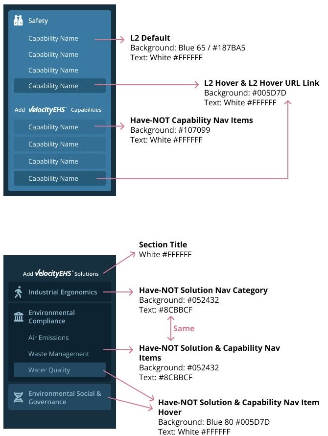 Click to enlarge
States, specified: default, hover, selected, have-not, each with its value, so engineering built one nav, not twelve.
Borrow the parts. Write the rules.
- 1The team chose PrimeReact instead of building from zero, trading visual purity for velocity across a dozen codebases.
- 2Every component got adapted, and every adaptation got written down: when to use it, when not to, and why it behaves the way it does.
- 3The documentation lived as clickable prototypes, shared as links other teams could open in a meeting or a code review.
Every component in the library was documented by state, because a state is where a design gets misread. Three of them, live:
Three tiers, five states each. One primary per screen; warning only for destructive actions.
Success, warning, error. Every toast says what happened and what to do next.
Skeletons show the shape of what's coming. A spinner only says "wait."
Prove the system where everyone will see it.
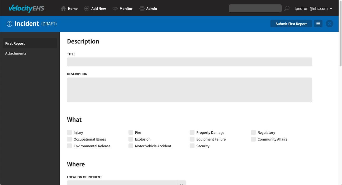
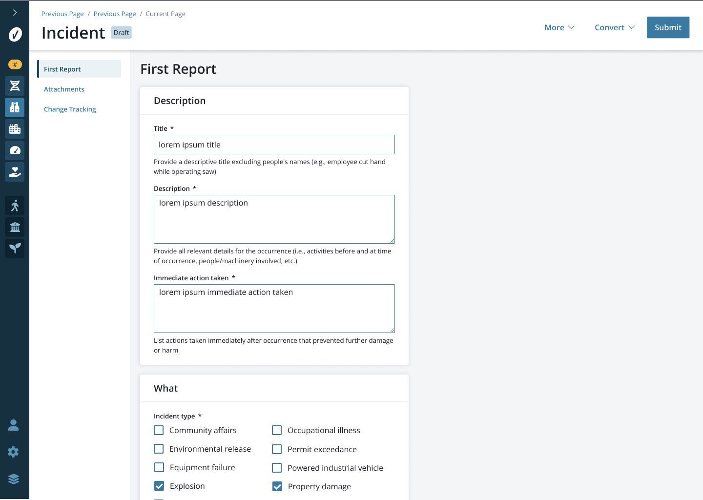
Legacy: every input grey. Is it disabled, or is it mine to fill in?
Every product was redesigned screen by screen with the new navigation, colors, and components, and each new decision had to fit the system without bending it. The incident form shows why it mattered: its inputs rendered grey, indistinguishable from disabled fields, so people hesitated on the ones they were required to fill. White inputs, a coach line under each, clear required markers, and the capability nav beside it. Small on paper; it sat in the path of every incident ever reported.
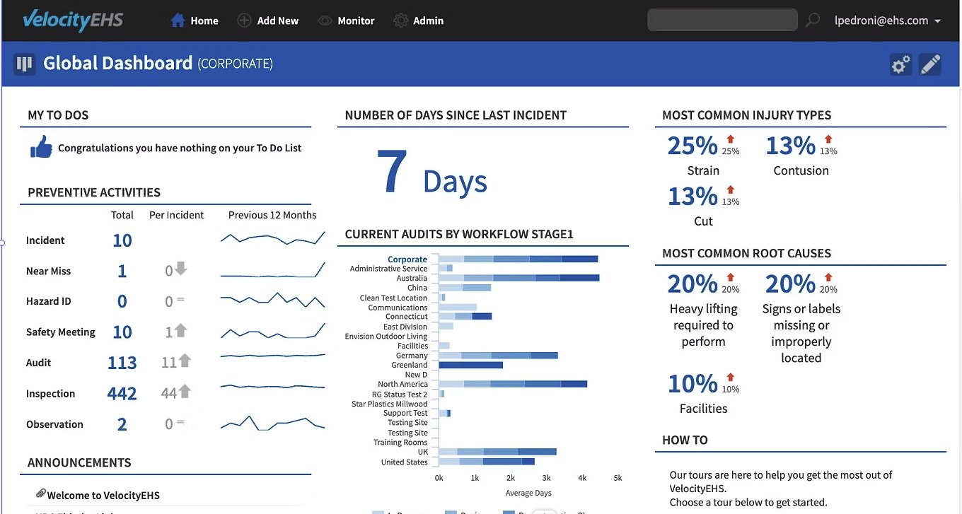
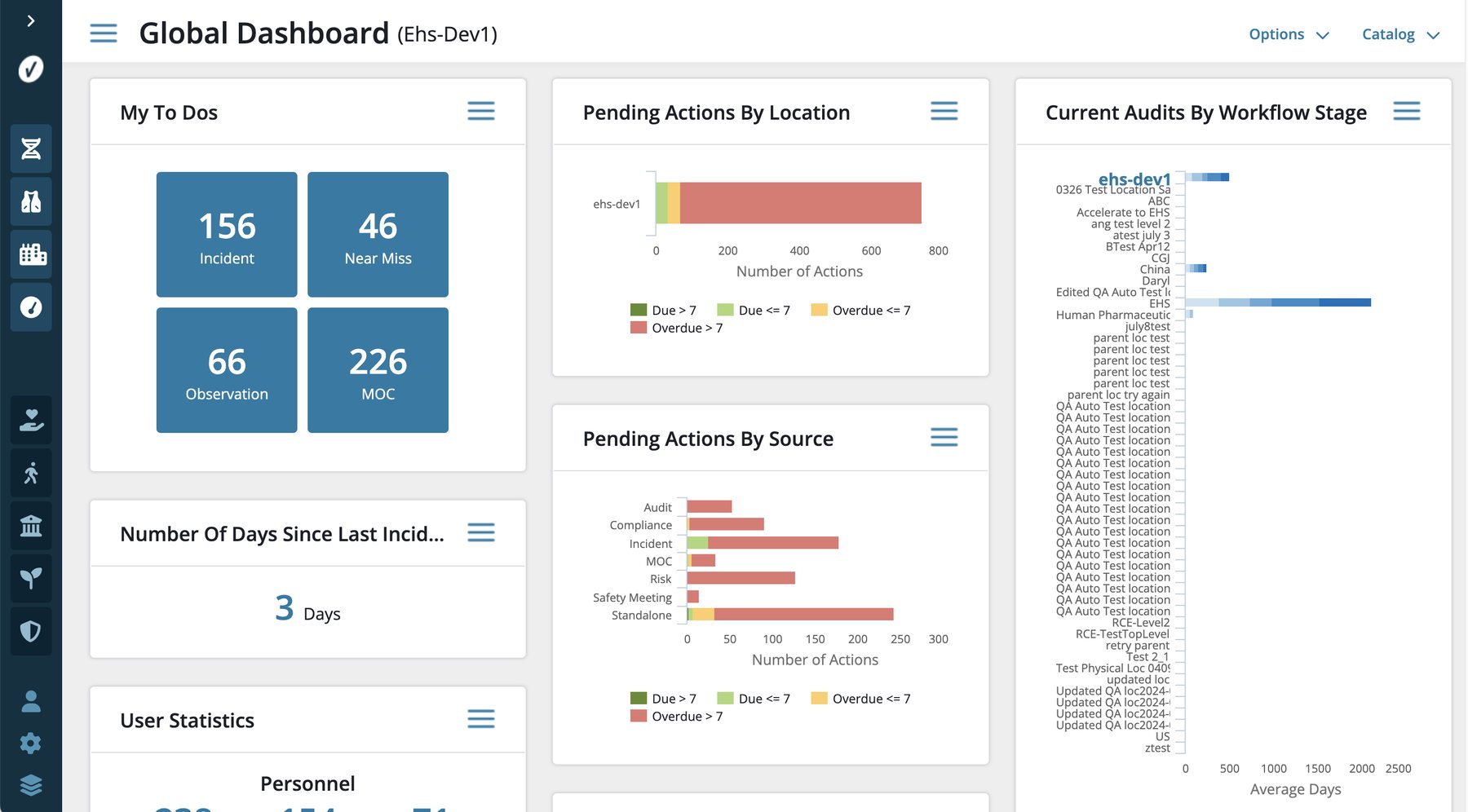
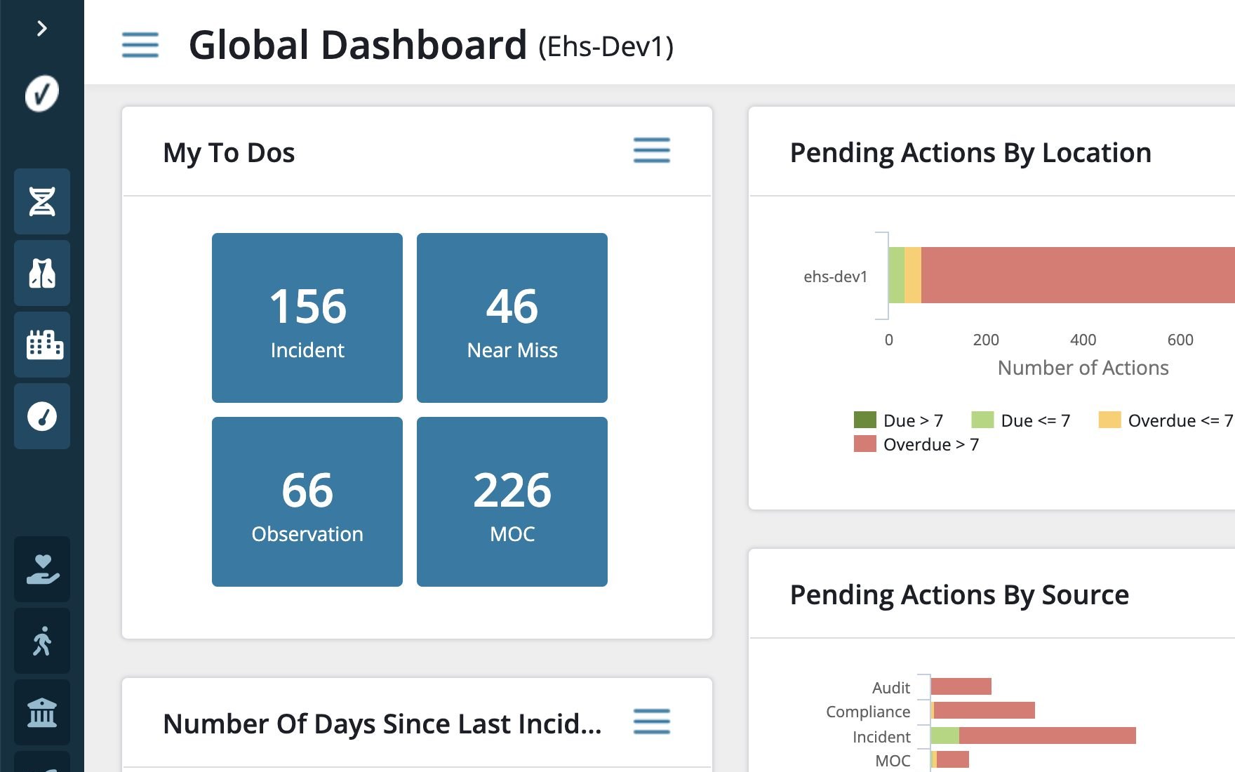
Legacy: charts and lists in one undifferentiated field, actions only on hover.
The global dashboard scattered charts across an undifferentiated field with actions visible only on hover. Contained cards gave people a scannable structure, and gave every future product a pattern to inherit.
Three places to look, so nobody had to guess.
A system only holds if people reference it instead of improvising. So every team had a link that answered their question. Development had the redlines and the component library. Product had the site map. Everyone had the education guide. When something wasn't covered, it got designed, documented, and added, and the link stayed the same.
Measurements, spacing, states, alignment rules. Opened every day. Vague handoff produces twelve slightly different implementations, which was the disease we were curing.
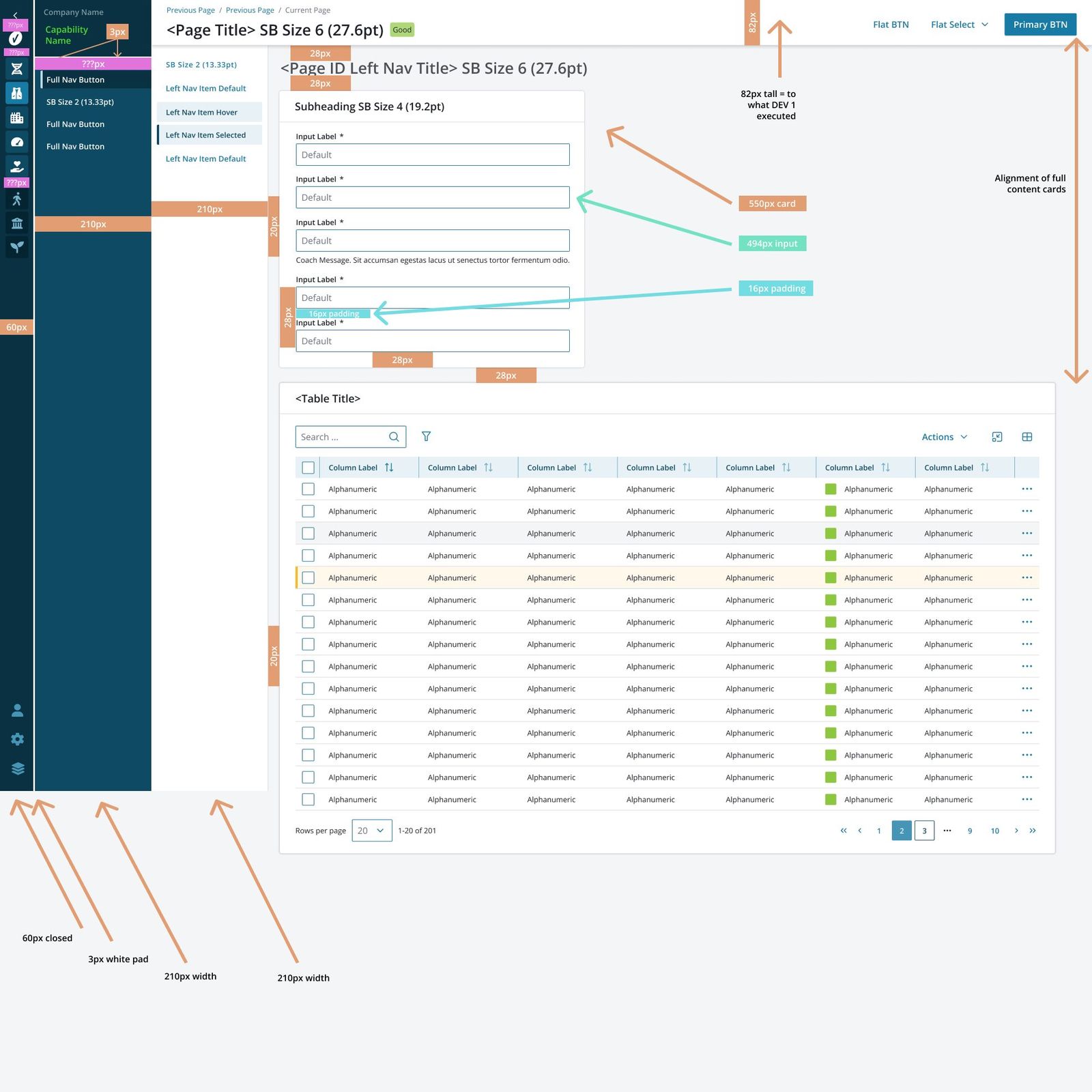 Click to enlarge
Every capability in the portfolio and where it lived, kept current as products moved. The shared picture of what existed, open on product's screens for two years.
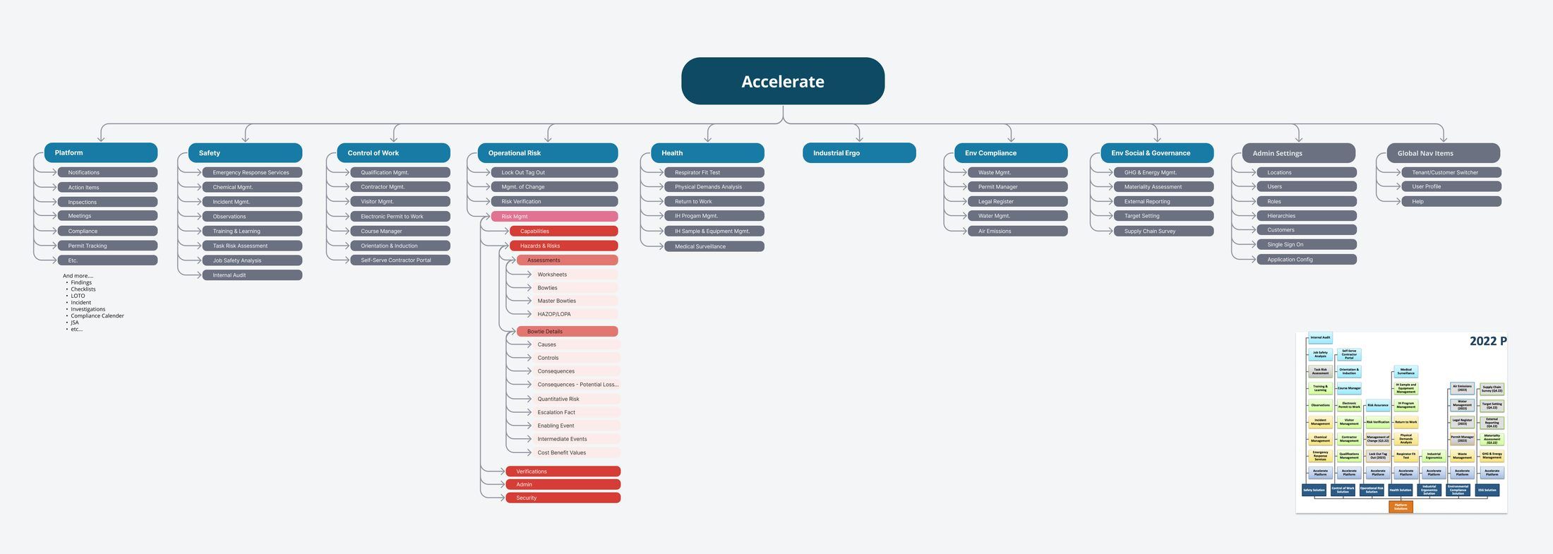 Click to enlarge
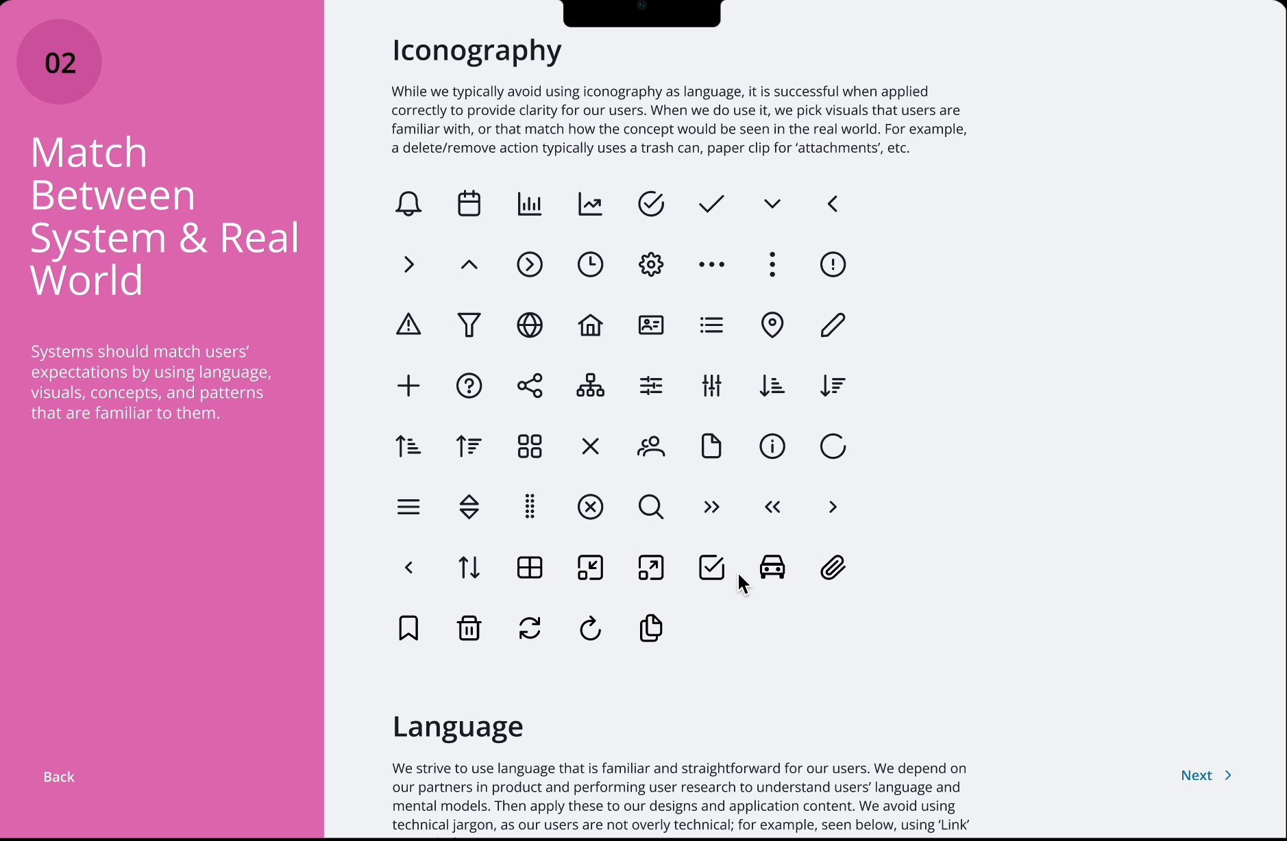
The ten usability heuristics and Fitts's law, illustrated with our own components, so the rest of the company could see what UX did and why.
Twelve products. One way in.
Twelve products became one platform without a single one going offline. Customers were excited by the uniform look and found it easier to organize their work inside it. VelocityEHS now describes Accelerate publicly as one secure login with centralized management across its solutions, and the platform was named a Leader in the 2025 Verdantix Green Quadrant. And the system made the next hard thing cheaper: two years later, Vēlo was designed on top of it.
Next: Forge Local, where there was nothing to inherit.