Student Success
Poor legibility and a cluttered layout, rebuilt as one system and shipped to win more students.
Everything they'd never defined.
Student Success helps students through assessments that produce personalized plans and practical tips, on web and Android. After launch, conversions to paid subscriptions came in under target, and the company asked for a complete overhaul of its visual style: brand colors, sizing, and type, plus the first style guide it had ever had. Over three months at the end of 2020 I audited what was there, built the system, and the redesign shipped on both platforms.
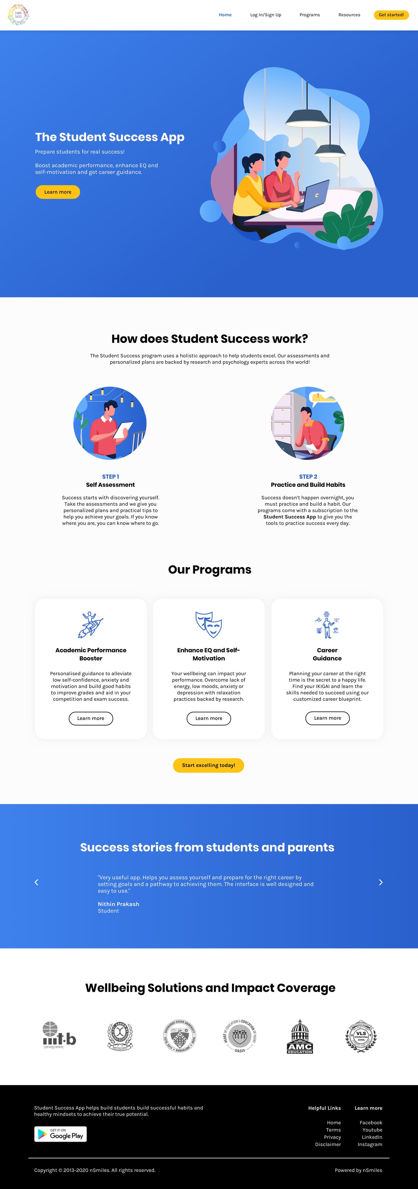
The shipped homepage, top to bottom. One palette, one call-to-action style, body text that passes. It scrolls on its own; hover to hold it.
Same company, same product, one system applied.
The old site and the shipped one, in one frame. The line sweeps on its own. What changes is not the content; it's that a single palette with jobs replaces three competing ones, one call-to-action style replaces several, and the text becomes readable at every size.
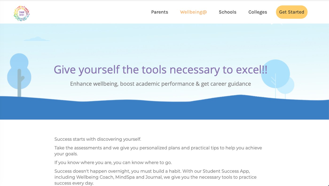
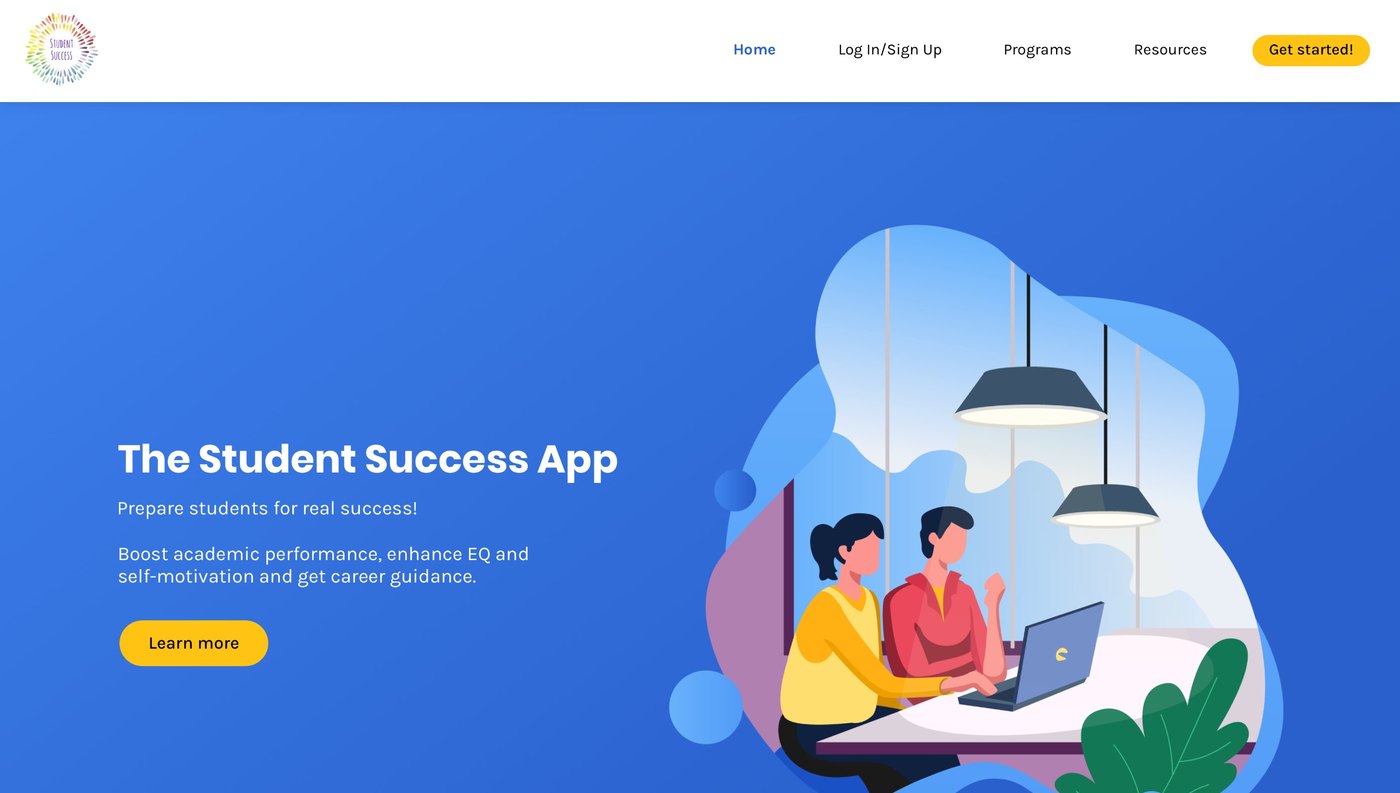 BeforeAfter
Before is the old site's landing page as captured in December 2020; after is the shipped homepage. Same site, same top-of-funnel moment.
The same site, styled five different ways.
Two calls with the CEO turned "conversions" into four words the product had to feel like: empowering, stress-free, welcoming, purposeful. The live site felt like none of them. Three accent palettes competed on one page, buttons came in three styles, body text sat under the contrast line, and nothing had a grid. The reasons were measurable, not matters of taste.
The callouts below each screen compute the actual contrast of the old site's colors, sampled from the screenshot itself, against WCAG 2.1. The screens rotate; tap a dash to hold one.
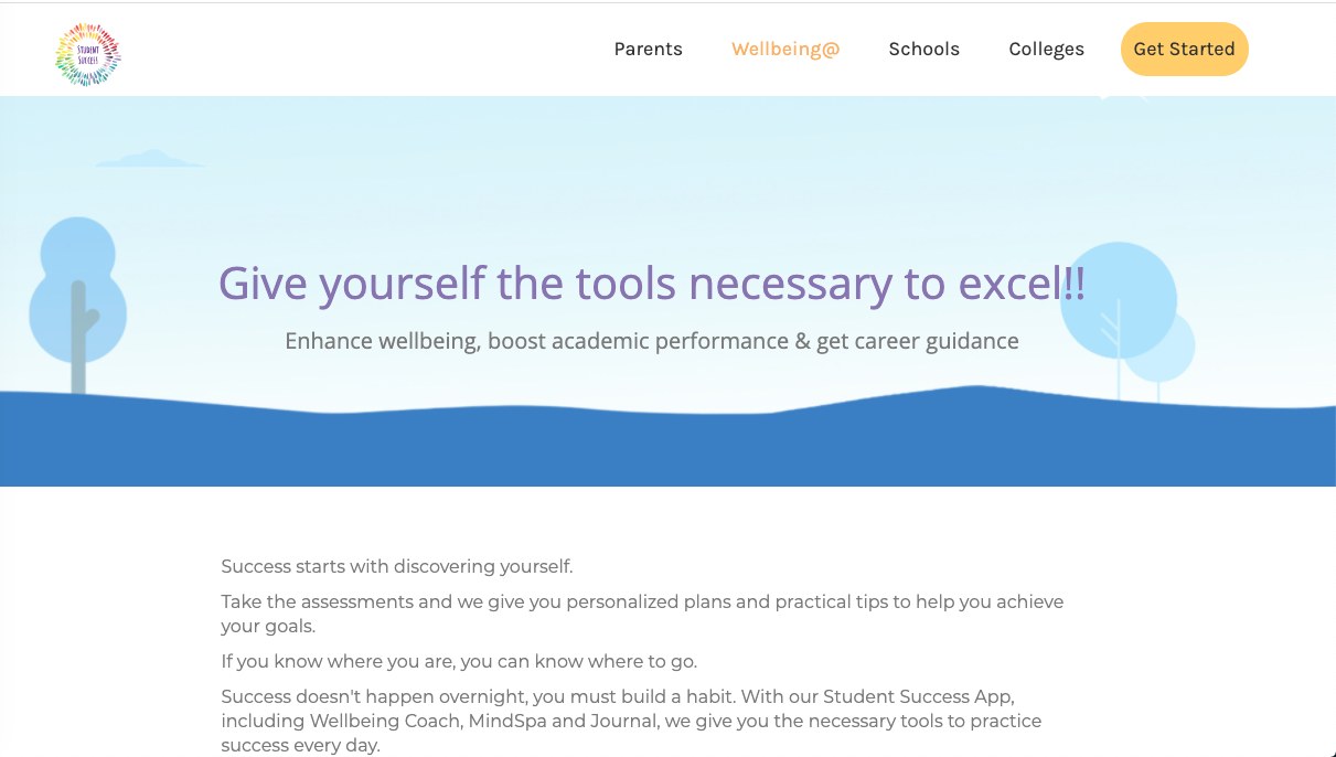
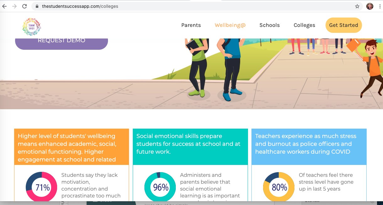
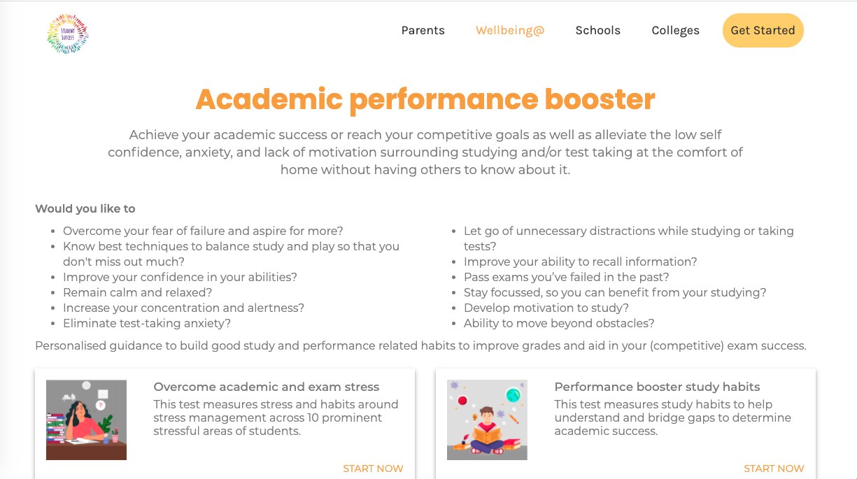
Three palettes, no grid, and text that fought the reader. Consistency was the fix.
Measure everything before anyone has a taste argument.
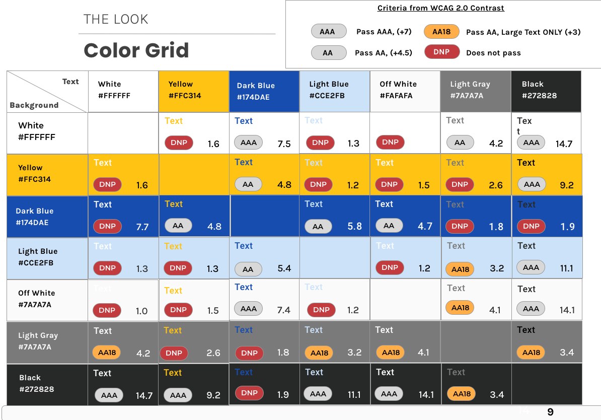
Every color was scored against every other color before a single new one was proposed. The audit was the argument: it turned "I don't like the orange" into "this pairing fails, and here's every other pairing that fails with it." Then the same grid became a tool for the team: which of the new colors can sit on which, so the palette gets used the way it was designed.
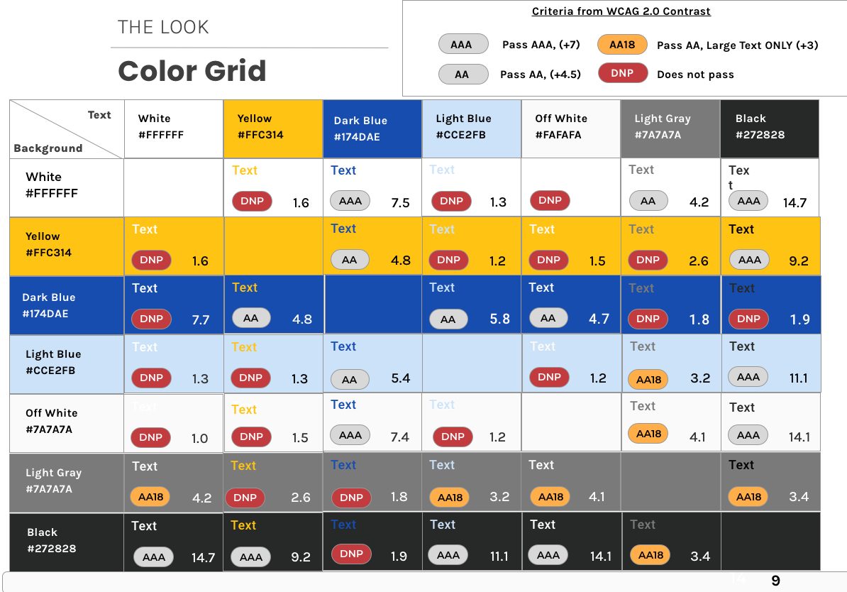
The color grid from the guide. Not a compliance exercise: a page that shows the team which of their new colors can sit on which, so nobody has to guess.
A seventeen-page guide, built inside the grid.
Everything downstream was designed inside the passing pairings. A dark-blue core with a role for every value. Icon states that change shape, filled versus outline, instead of nudging a hue. A 22-column grid for web and a 6-column grid for Android. Poppins and Karla on the web, Roboto on Android, and, for the first time, a defined treatment for long text. The CEO's four words sit in the guide as principles, so whoever extends it later has the same brief I did. Leaf through it.
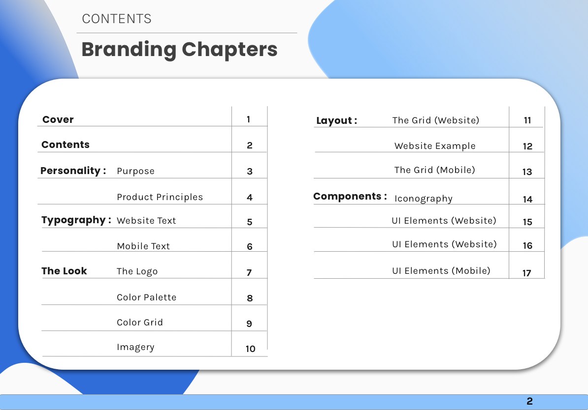
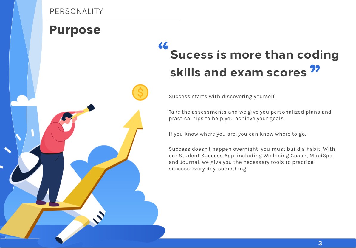
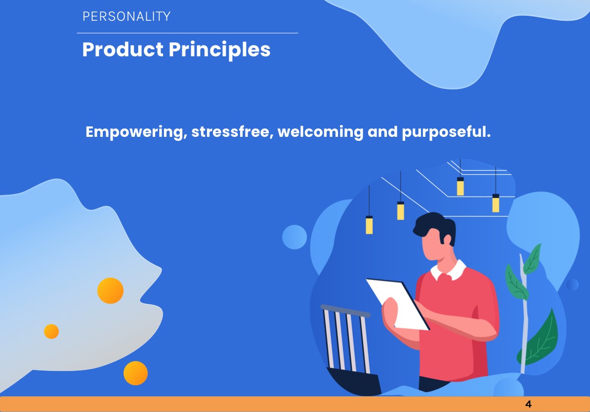
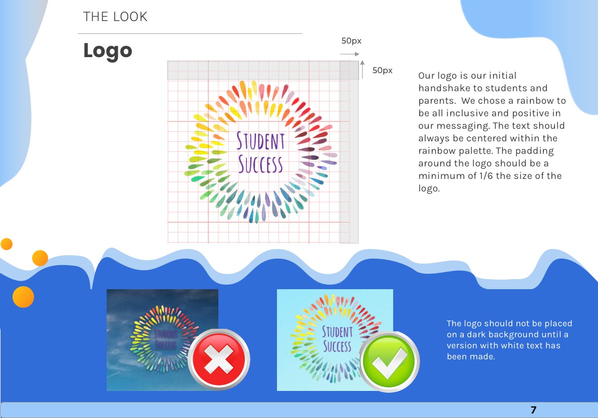
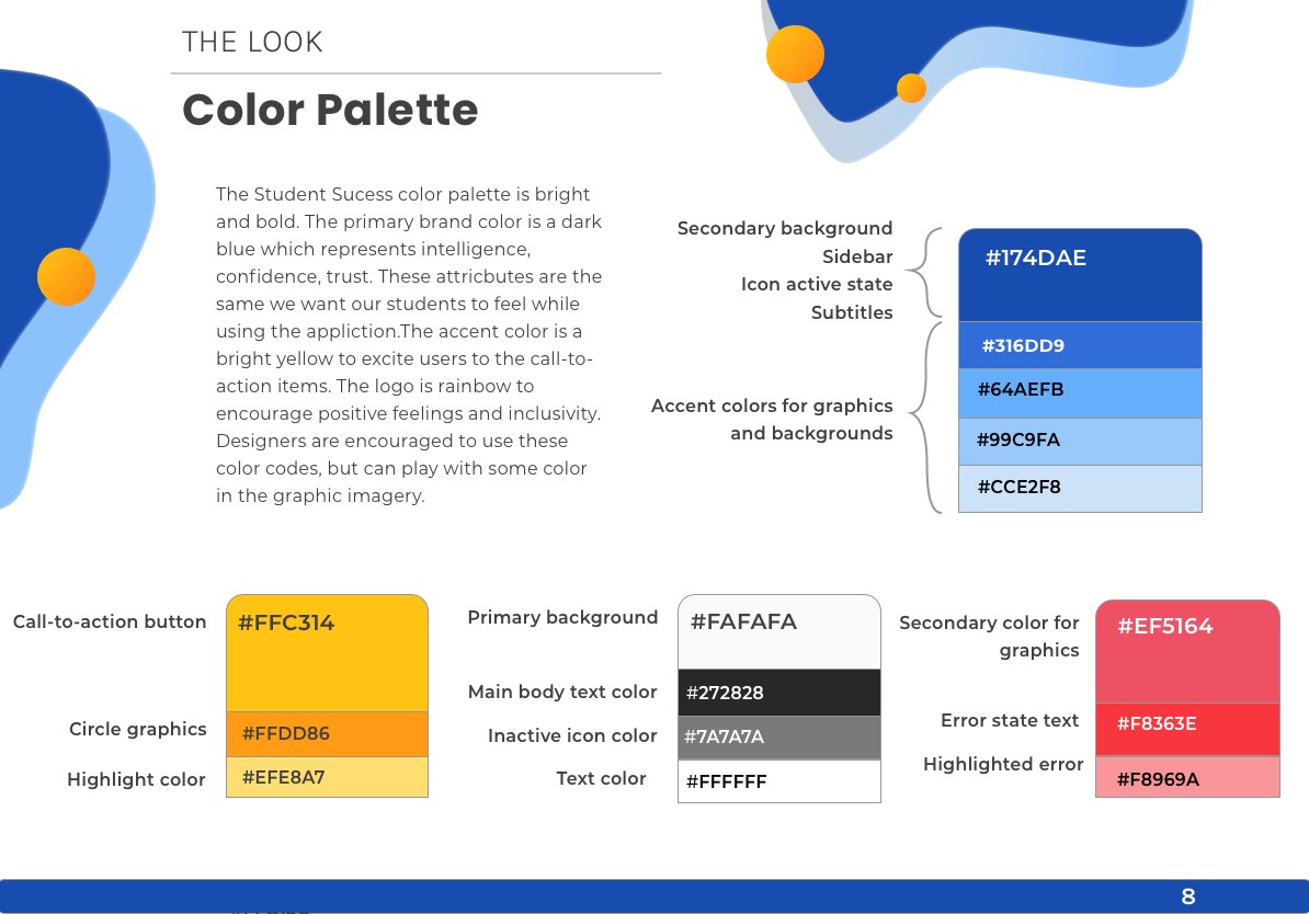
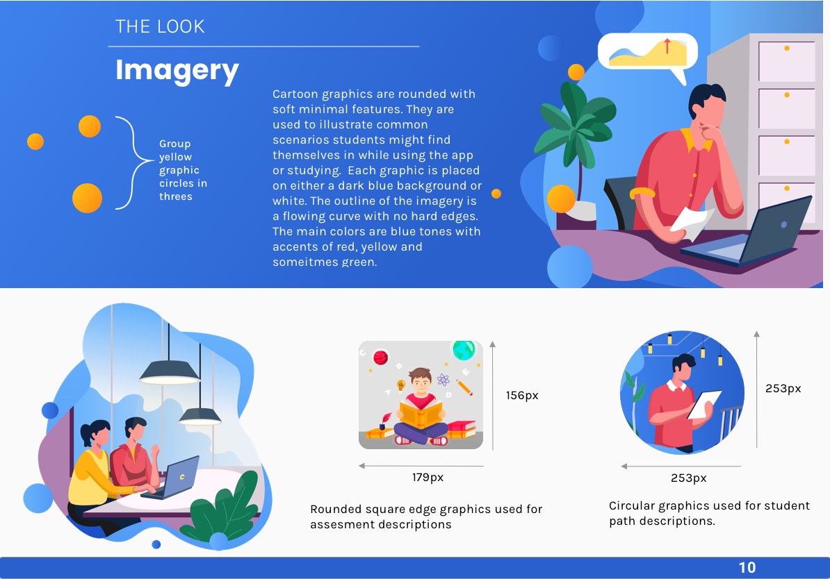
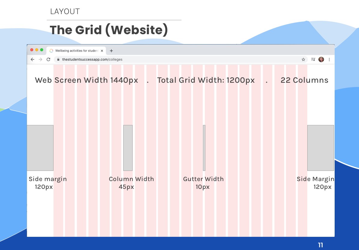
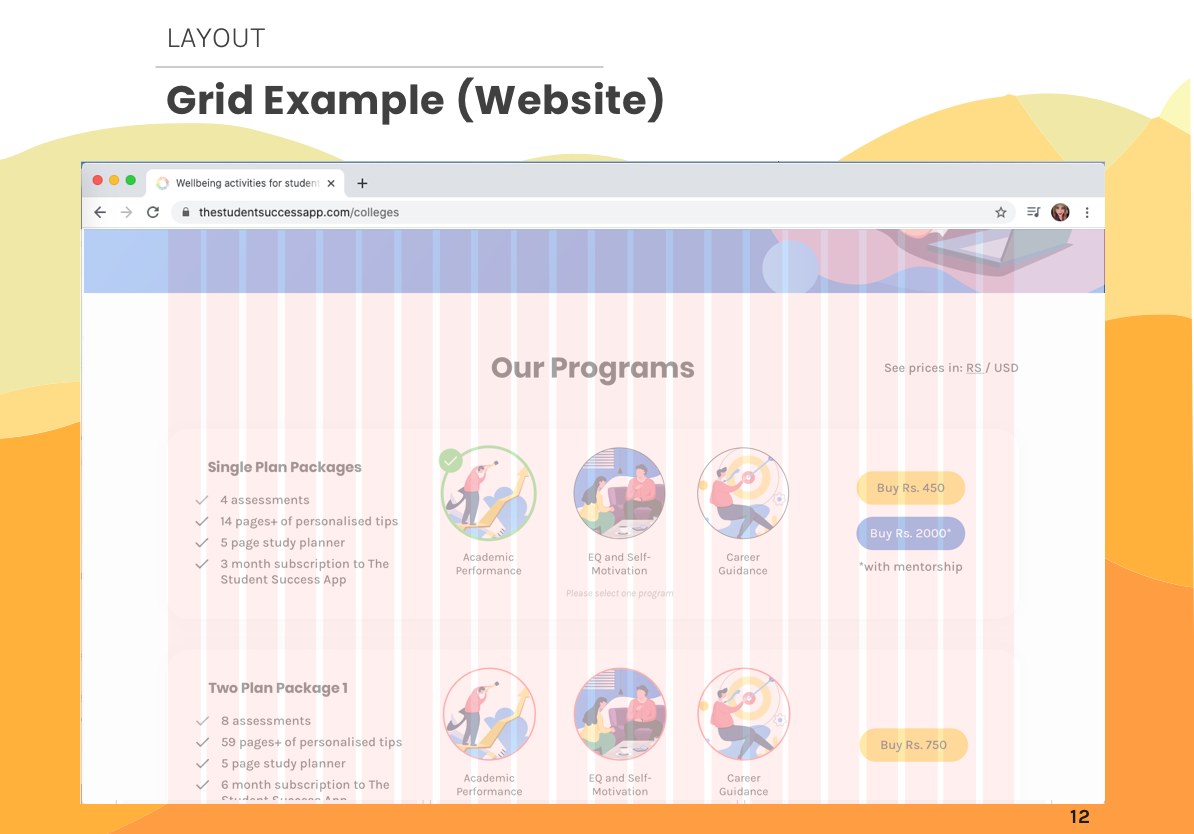
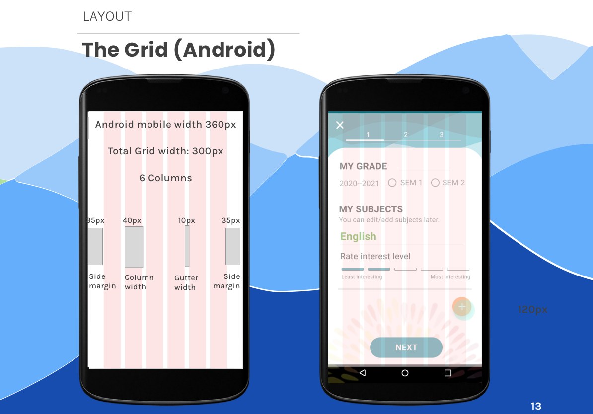
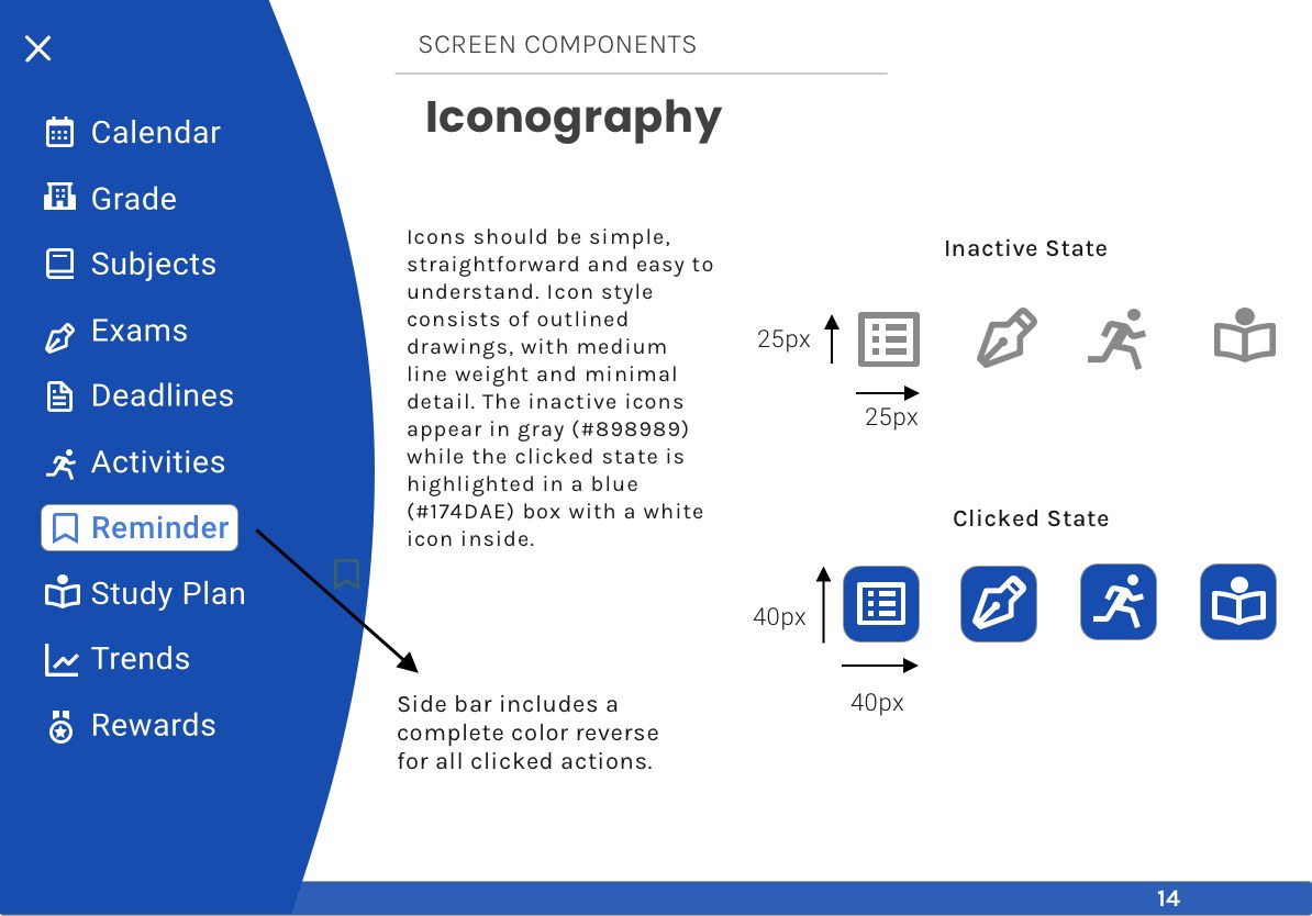
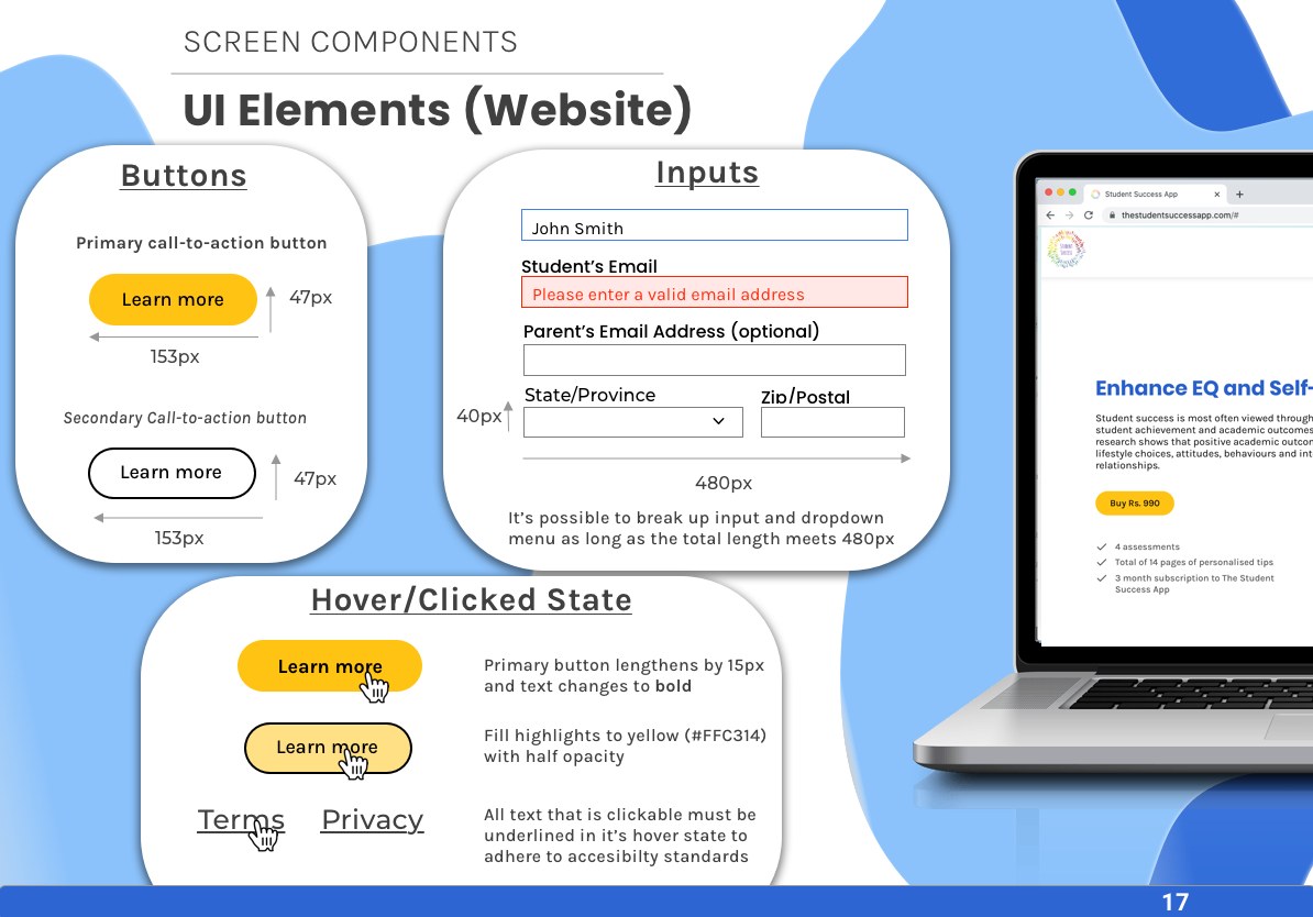
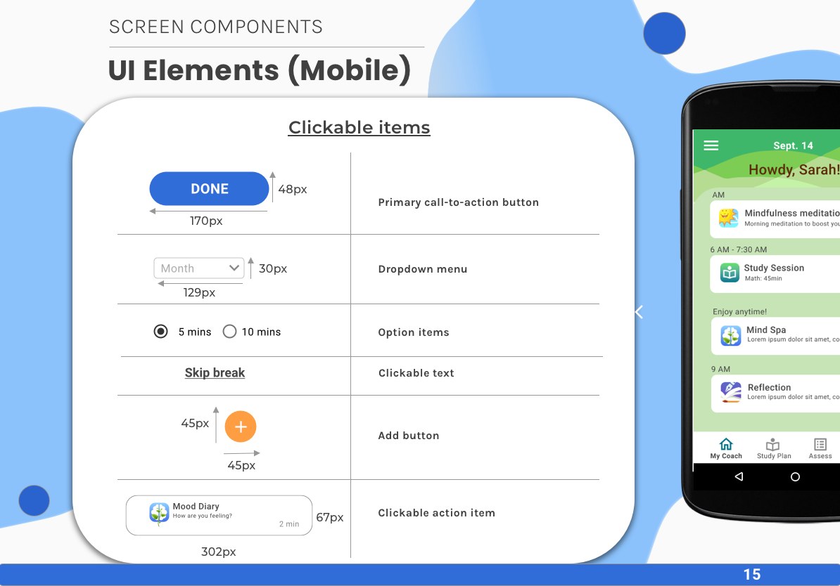
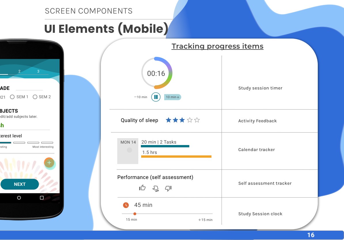
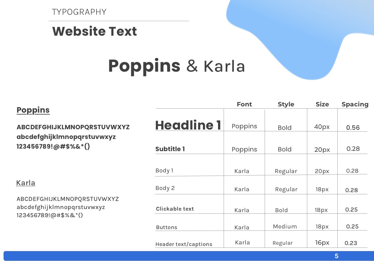
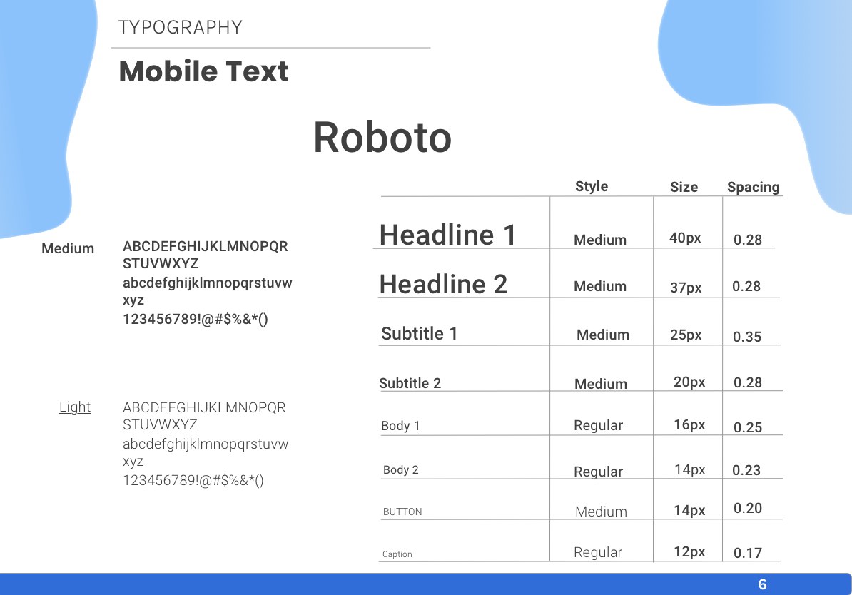
The whole system, on both platforms.
Student Success adopted the guide as its single reference and shipped the redesign across web and Android. Three of the shipped pages are below, full length; hover to scroll them. One palette, one call-to-action treatment, body text that passes, a logo placed where it can be read. For a company that had never had a style guide, the guide became the thing every later decision was checked against.
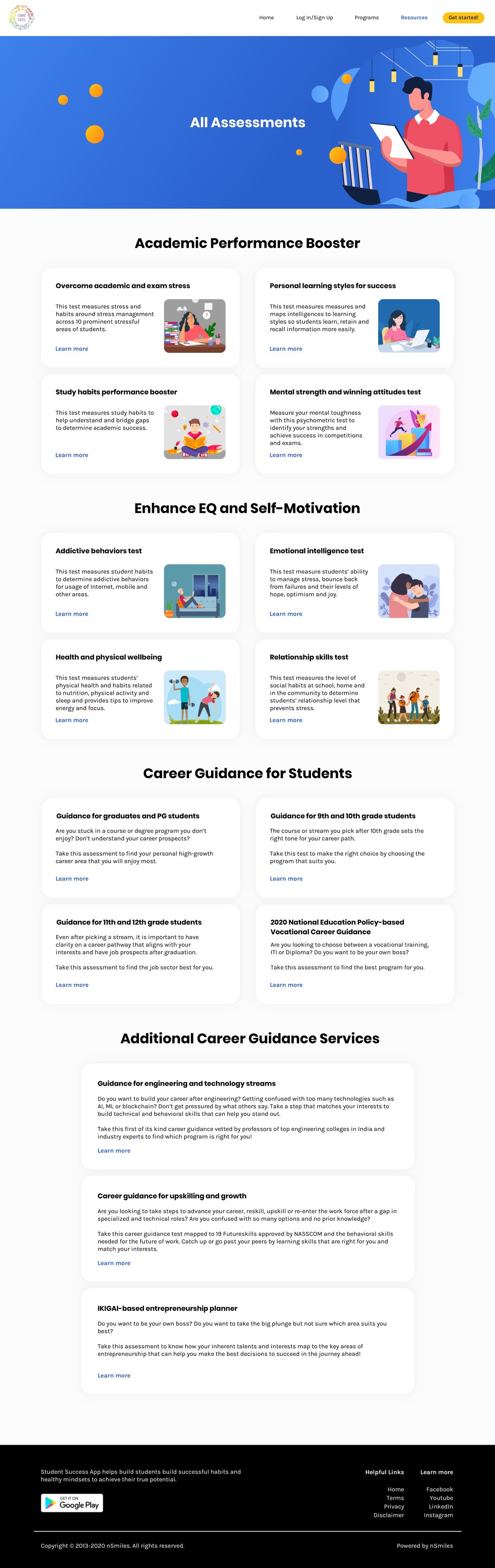
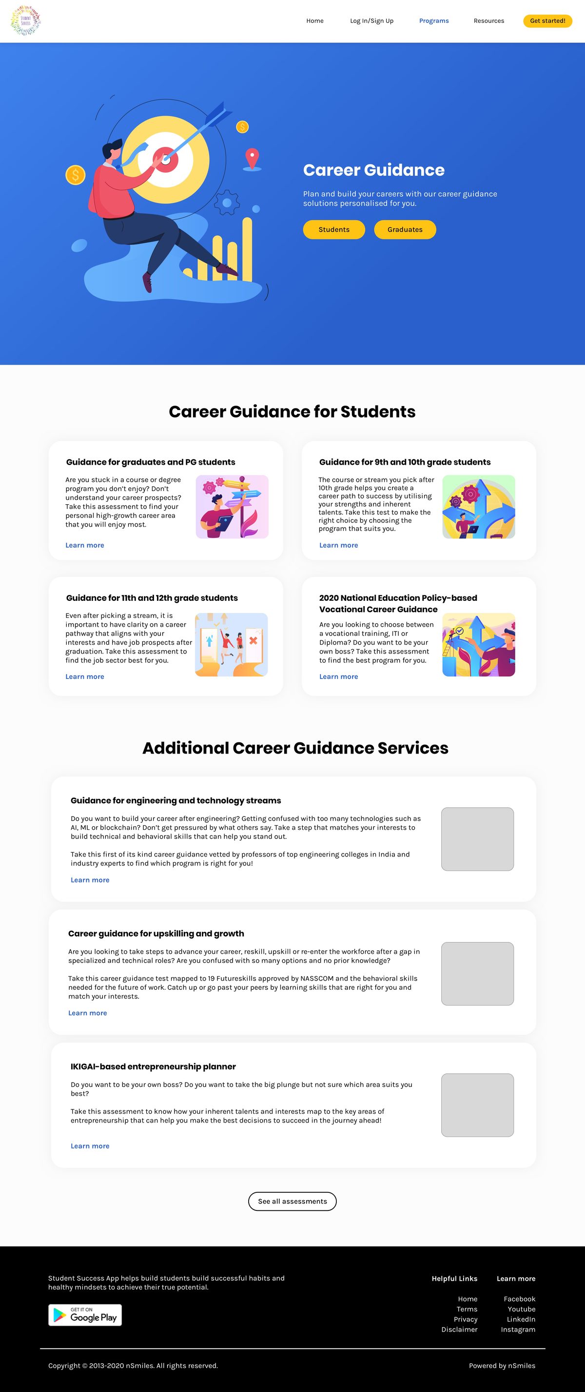
The company had never had a style guide. After this, every visual decision had somewhere to be checked against, and the site finally looked like it was made by one team.
Back to the start.